
It seems fitting to look at another 1990s dinosaur book on the blog following (part of) Dinosaurs of the World, and given that there seems to be a resurgence of ’90s-style dinosaurs in popular culture recently for some reason. Dinosaurs! Strange and Wonderful was published in 1995 by Boyds Mills Press, written by Laurence Pringle, illustrated by Carol Heyer, and sent to us by Jordan Waltz. Thanks Jordan! Jordan remarked that “there is something very unique about the airbrush-esque paintings”, and I’m inclined to agree. In many respects this is a typical 1990s kids’ dinosaur book, but the art style is certainly quite unique – not only in terms of technique, but because it’s so ruddy dark. As in, literally dark, like every illustration is of a night scene. None of them are especially terrible – Heyer is a skilled illustrator – but it’s great fun to spot the copycats and palaeoart tropes as they appear.

Let’s start with some Apatosaurus, why not. Yes, it’s dark, and yes, the animals have weirdly thin necks, although that’s something people are forever getting wrong about Apatosaurus (and Brontosaurus). On the other hand, these aren’t too bad for the time; they aren’t terribly overweight and blobby-looking, as so many apatosaurus in particular continued to be well into the 1990s (the ‘fat Diplodocus‘ meme took a long time to die). They also have the right sort of teeth, more-or-less, and Heyer clearly knew enough anatomy to at least make them look convincing. Certain details are incorrect, but this is a decent illustration for the time, and I can’t see that it’s a blatant copy of anything. Although I may well be wrong on that account, because…

…these Allosaurus are so obviously based on a Stephen Czerkas model, it’s rather funny. I mean, couldn’t Heyer at least have varied the positioning of their forelimbs a little more? These allosaurs are transparently the same model drawn from different angles, and precious little attempt has been made to hide that fact (although bizarrely, Czerkas’ correctly positioned hornlets and snout ridges have gone missing). As with the previous piece, the vegetation is a little sparse here, although what Heyer does include is quite beautifully drawn.

In the 1990s, it was extremely popular to have a brachiosaur’s enormous limbs take up most of the frame, just to emphasise how honkingly massive it was. I believe this trend was started by Gurche, whose astonishing painting depicting a herd of “Ultrasauros” dwarfing a group of allosaurs (from 1989) was copied or referenced by absolutely everyone. “It’s…it’s a dinosaur!” Here we have Heyer’s take, and it isn’t bad. The sauropods are well proportioned and quite Paulian, although bulkier than Paul would have made them. The way that water glistens on the scaly skin of the foreground individual is quite marvellous. The scales are oddly large, but I actually prefer that to Gurche-style leatheriness (‘fraid so). The inaccurate hands are forgivable, given the time. What does bother me is something that probably stuck out at you when you first clapped eyes on this image – namely, that the small pterosaurs flying in front of the brachiosaur appear to be Pteranodon. Which lived in the Late Cretaceous, and appears again in a more fitting context below. Huh?

Sometimes, animals in this book are presented in pairs. What I particularly like about this pairing is that, although it is ostensibly contrasting two very different dinosaur habitats, the animals featured are both hadrosaurs, and therefore not too distantly related. Relatively speaking. The illustration on the left here also marks a notable departure from what we’ve seen so far in that it features very lush vegetation. In fact, the way that it features large animals as almost incidental characters in a wider ecosystem is a little Hendersonian, and all the better for it. The composition of this piece is very effective, too, in making this appear more naturalistic than it otherwise might have. It’s easy to imagine stumbling upon these two edmontosaurs while walking through thick woodland. The illustration on the right, meanwhile, is a perfectly good illustration of Parasaurolophus for 1995, but not much more than that. Never underestimate the power of strategically placed foliage, as I always say to people when they ask why I haven’t been arrested yet.
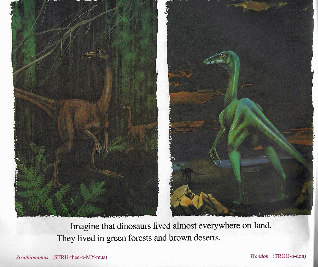
Heyer attempts something similar with Struthiomimus in this pairing, and while the dinosaur is pretty well done and the foliage is lovely, it can’t match up to the edmontosaurs above. Nice redwoods, though. Meanwhile, the Troödon (with ’80s metal umlaut) is very obviously based on the Russell/Seguin model (with further shades of Sibbick’s Normanpedia piece) – the head, hands and feet are a dead giveaway – but at least, this time, it’s posed somewhat differently to the original, so it’s not an out-and-out copy. Furthermore, not only is it beautifully painted, but the eyes have a wonderful glassy quality to them.

And speaking of beautifully painted things, check out this Pachyrhinosaurus profile. It does have a few anatomical/perspective-related issues, although these are pretty forgivable given the context. What I like about it is the artistic technique, particularly in painting such fantastically tangible, glistening scales. They probably shouldn’t be so large – there’s a slight diminishing effect, as if Pachyrhinosaurus were only as large as a gila monster, as opposed to a rhinoceros. Nevertheless, it’s lovely to look at. The hint of a third eyelid in the eye is a pleasing, and surprisingly subtle, touch. It occurred to me recently, watching a gull staring in from outside my office window, that the inclusion of a nictitating membrane would greatly enhance so many reconstructions of dinosaurs in palaeoart and pop culture. Imagine the T. rex in Jurassic Park, lunging down at the Explorer with a translucent, reptilian film over its eyes…

And speaking of Rexy, here’s Heyer’s version. It’s…not great. It has the appearance of having been drawn by someone who’s seen an awful lot of artwork depicting Tyrannosaurus, but has never actually taken the time to look at the real animal’s skeleton before. Which may well have been the case, and if the illustrator was stepping outside of their comfort zone to earn a crust, I shan’t blame them too much. However, this is a bad illustration of Tyrannosaurus in pretty much every respect. Its skull is the wrong shape, its teeth are the wrong shapes and sizes, and its neck and shoulders are a bit all over the place. It also looks rather like it’s adorably waving at the audience, in spite of the obvious emphasis on massive teeth and copious slobber.
I’ve noted a few times over the years that books with otherwise fairly decent illustrations of dinosaurs always seem to mess up T. rex. It’s a peculiar phenomenon that I’d be quite interested in investigating further. I often get the feeling that artists just assume they know how to draw a T. rex, as they’ve seen it so many times, and so aren’t so careful as they are with other dinosaurs. But that’s a big old pile of pure speculation.

Moving from big smiley heads back to oversized frame-filling feet, and here we have Deinonychus, and it’s not all that bad. It’s very consciously birdlike (what with those tarsal scutes and all), which is no bad thing, and it certainly gets the point across about those massive claws. I didn’t even notice the shadow on the ground at first glance – it’s another nice touch. Take away the obviously very scaly background individual, and this could almost pass muster today.

And finally…another dromaeosaur, this time in easily the most dramatic scene of the book. Yes, it’s Velociraptor v Protoceratops, set against a fantastically well-painted thunderstorm for maximum theatrical effect. I love it. The dinosaurs don’t look too bad, although there are some peculiarities here that I’d like to point out because they’re interesting to note, and also I’m quite mean. Firstly, it’s not entirely obvious where the Velociraptor‘s pelvis is supposed to go, and while I get that its thigh is pointing out towards the viewer, it does look a little awkward. Secondly, the Protoceratops has comically tiny forelimbs and hands which are only noticeable on closer inspection. The reconstruction as a whole appears to be based on a Sibbick piece that depicted the animal semi-crouched on an upward slope, facing away from the viewer, with this forelimbs obscured by its hindlimbs. Heyer seemingly only had this reconstruction as a reference, and so apparently didn’t know what to do with the forelimbs on her (now rearing) beastie.. Hence, Prototrumpatops. But I can’t go out on such a note, so I’ll say again that the atmosphere in this piece is wonderful, and Heyer’s rendition of a lightning storm is quite beautiful, peculiarly proportioned dinosaurs or no. I now want to find out if she’s illustrated any dinosaurs since…


3 Comments
Trey Baldwin
July 13, 2018 at 10:54 amThe tyrannosaurus looks a whole lot like the one from the classic Sci fi film The Land Unknown.
Andreas Johansson
July 17, 2018 at 11:26 amVelociraptor the size of a wolf?
Bradley Lacke
July 25, 2018 at 3:47 pmI LOVE THIS SITE!!!!